Optimizing Digital Product UX: 10 Best Practices
Creating a fully optimized digital product that addresses user needs and adapts to changes can be achieved by following critical UX best practices. These practices guide your collaboration with UX designers to enhance your product’s user experience and gain a competitive edge. But what is UX design? And what actions can you take to optimize it and improve your product? UX design encompasses the process of designing a system that delivers a positive experience for its users. Whether it’s a minimum viable product or a final product, several best practices can be followed to align your product’s UX with your company’s goals.
The tips outlined below can be applied to various digital products such as websites, mobile apps, and other digital interfaces. Following these UX design best practices can create a cohesive, effective, and long-lasting effect. Where should you start?
1. Design For Accessibility

When designing your product, it’s crucial to keep accessibility in mind for the largest possible group of users. According to a 2011 report by the United Nations, there are 1-1.3 billion people with disabilities globally. People with disabilities make up the most significant minority population, so it’s essential to consider how accessible your product is to all potential users during the UX design process. To ensure accessibility for all users, regardless of their abilities or context, it’s essential to incorporate certain design elements. Here are a few examples:
- Make sure to consider colour blindness, which affects about 8% of men and 0.5% of women worldwide (according to colorblindawareness.org). Use a contrast checker to ensure enough contrast and avoid relying on colour alone to convey important information. Use a combination of text, colour, and graphical objects instead.
- Test your product’s usability on multiple devices to ensure it’s responsive and appropriately scalable for the visually impaired.
- Use alt text for images in case the photos don’t load.
- Be inclusive by including options for gender.
2. Designing For One-Handed Mobile Use

Inclusivity also extends to the placement of elements on mobile devices. While it’s becoming a common practice, it’s still important to place navigation menus at the bottom of a mobile screen for optimal UX design. In the past, smaller screens allowed users to reach the top of the screen with one hand easily. However, with larger screens becoming more prevalent, it can be difficult for users to reach the top of the screen with one hand. One of the best practices in UX design is to place the navigation at the bottom to make it easily accessible with one hand and avoid user frustration. It’s also essential to put other crucial elements, such as the option to create a new message on a messaging app, at the bottom of the screen. Be bold and conduct user testing and usability tests to find the design elements that work best for your users.
3. Improving Scannability On Your Website

Scannability refers to how easily users can read and understand a block of text. Like reading a newspaper, users tend to skim content to find what they’re looking for rather than reading it word for word. Therefore, adjusting your UX design standards to reflect this behaviour is essential. To make your content more precise and concise, keep it aligned with the two basic rules of UX writing: make it simple and easy to understand. Confusing users with poor scannability can lead to frustration and abandonment of your product. Here are some tips to improve your content’s scannability:
- Use bullet points
- Keep paragraphs short, ideally under 5 sentences
- Eliminate filler words for shorter, more direct sentences
- Use sub-headers to organize content
- Choose colours and typography carefully to avoid cluttering the design
- Use white space around content and double spacing between paragraphs for easy reading
- Double-check spelling and grammar to maintain professionalism.
4. Keep Important Content Above The Fold

The “above the fold” refers to the section of your website that users first see when they land on a page. One of the critical UX best practices is ensuring that all of your beneficial information and content is kept above the fold and easily accessible. This means that users should only have to scroll a little, as the “below the fold” is where people often leave the page. A high bounce rate can indicate a poorly designed landing section. This UX design best practice is essential for mobile users, who are likelier to leave the page than desktop users.
5. Use Storytelling

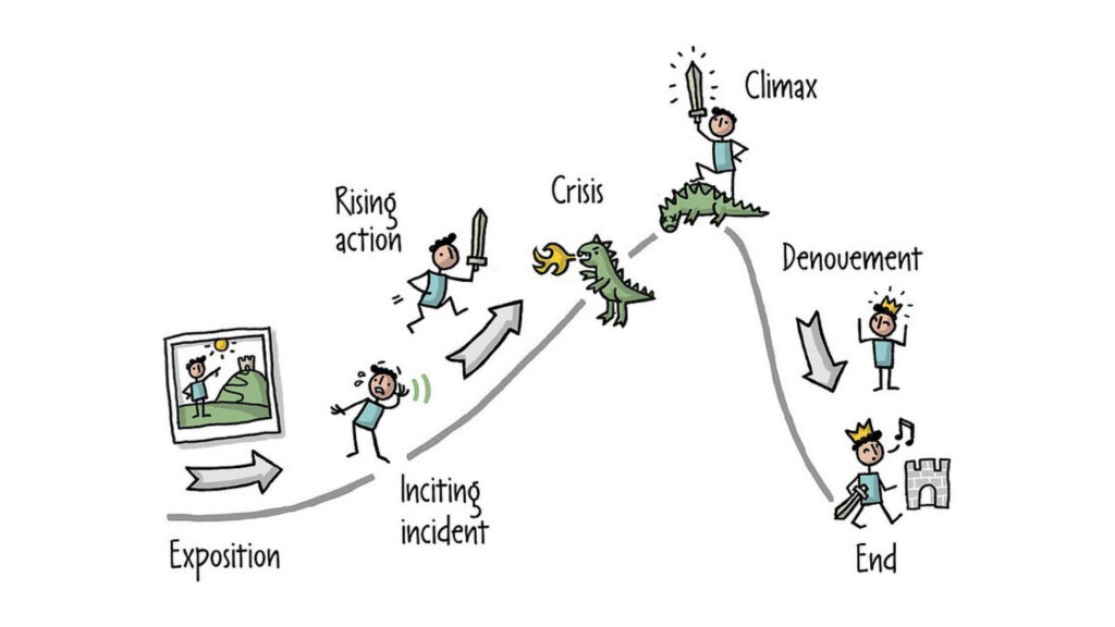
Most people process information better when presented as a story. Stories evoke empathy, emotion, and attachment, making it a best practice in UX design to use these emotional reactions to improve engagement with your product. Stories can make your digital product more exciting and help users develop a deeper understanding of your brand. To make it more powerful, instead of just telling a story, including a video of it. Audio and video are powerful ways to help people understand and relate to the product. When using videos in your design process, convey authentic emotions and simple concepts, as people are more likely to trust and like others when they believe they see genuine emotions. Storytelling should be included in any list of UX best practices because it actively engages your user and creates memorable interactions.
6. Managing Cookies

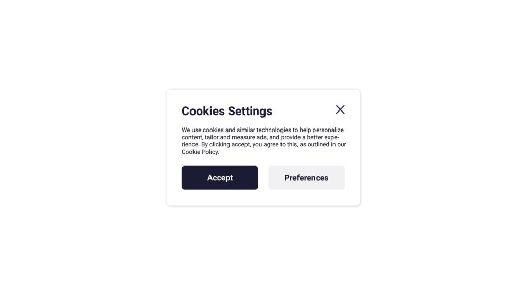
By default, turn off all non-essential cookies. If your website doesn’t collect or track any personal data from users or only collects anonymous data, you may not need a cookie notice. Turning off non-essential cookies is one of the easiest UX best practices. Additionally, use clear call-to-action copy on cookie notices. For messages that only use simple statements such as “By using our website, you agree to our use of cookies,” ensure the user is still presented with the option to acknowledge. Instead of just a close button, use “Accept and continue” to clarify the prompt’s intent. It’s also important to be transparent about what cookies are used for and allow users to choose their preferences. This simple UX design tip will empower the user and give them a sense of control.
7. Having A Logical Information Architecture

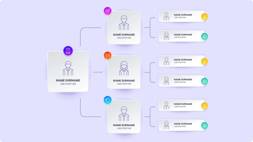
Another critical UX best practice is ensuring that you have a logical information architecture, particularly for more oversized products with a large number of pages and a substantial amount of content. Ask yourself, how easy is it for users to navigate your website? One way to ensure a logical information architecture is through the card sorting method. In this UX research method, participants group individual labels written on post-its according to criteria that make sense to them. This method reveals how the target audience’s domain knowledge is structured and helps to create an information architecture that matches users’ expectations. To ensure you’re following UX best practices, list the topics and features you want to include in your product. Write them on post-it notes and invite at least ten people (individually) from your target audience to group those post-it notes into different categories. Ten people are the minimum number to indicate user patterns. Once you have the results of the card-sorting sessions, you can draw some conclusions and make a sitemap. A sitemap is a hierarchical list of things you want to include in your product. For example, you will need a settings page. On that settings page, you will need functionalities like changing the password, changing the email, deleting the account, etc. All of this user research will ensure that the structure of your product makes sense and that your users can easily find the information they need.
8. Simplicity Is Vital

Anything that hinders the user’s goal is a distraction and should be removed. Ask yourself, are there any unnecessary elements in this design? How will each component of the design impact customer behaviour? Does the user interface need to be more explicit? Every UX design element in your product should contribute to achieving the primary goal. Users expect simplicity, which is usually achieved through minimalist and consistent design. The minimalist design includes simplicity, clear thinking, individual functionality of each element, elimination of non-functional aspects, and meaningful expression. ‘Less is more’ is one of the best UX design practices as it focuses on essential details and delivers an uncluttered and consistent experience. To achieve this, think carefully about your visual style, the design trends you want to incorporate, and how you can meet user needs as efficiently as possible.
9. Consistent

Consistency is crucial if you want to create the best user experience. Every time a user interacts with your product, the process should be easy and familiar. Suppose a user has to find a new way to solve a problem every time they navigate a consequence. In that case, they will become frustrated and develop a negative relationship with your product. In addition to the apparent usability benefits, having a consistent product creates a sense of professionalism and evokes trust. Like many other UX design best practices, this tip is easy to implement but can significantly impact your final product.
10. Use Animations

Visual feedback is essential in UX design. In real life, buttons and other controls respond to our interactions, and this is what users expect in digital products. One of the best UX design practices is animations and transitions to give the user more context and a better understanding of how the product works. Animated objects grab the user’s attention and guide them to the next step of an interaction.
For example, minimizing a window on MacOS activates a motion in which the window is minimized to the navigation bar at the bottom. This ensures that the user knows where to find the window when it needs to be opened again. This simple design pattern influences user behaviour and provides a reliable user experience. In addition, animations and transitions can make the product experience seamless and create a more positive relationship between the user and the product. When elements move between states, the movement should be fast enough, so users don’t have to wait yet slow enough so users can understand the transition.
A general rule of thumb is to keep the animations at 300ms or less. It’s also important to consider how animations and transitions are used throughout the product. If they are used consistently and logically, they can enhance the user’s experience. If they are used randomly or confusingly, they can detract from the user’s experience. Using animations and transitions in your design can add visual feedback and make the experience more seamless. Still, it should be done carefully to ensure a consistent and logical user experience.
Improving User Experience Continuously
By following these tips, you can ensure that your UX design decisions keep users informed, address their needs, and align with your overall business goals. By implementing some of these best practices, you can create user-centric digital products and drive innovation within your product team. Remember, user experience design is an ongoing process, and it’s essential to continuously gather feedback and make improvements to meet the evolving needs of your users.
Manish Surapaneni
A Visionary & Expert in enhancing customer experience design, build solutions, modernize applications and leverage technology with Data Analytics to create real value.
Other articles

Manish Surapaneni
Stop Outsourcing Your Ethics, Tech Leaders
Setting up their own ethics committee is a step forward for tech companies, as they are the clear winners of

Manish Surapaneni
How To Beat The Tech Talent Squeeze In 2023: 6 Proven Strategies
In the current economic climate, with rising costs and increased job turnover, one of the biggest mistakes a company can

Manish Surapaneni
How Augmented Human Intelligence Can Enhance Our Lives With Machines
The advancement of technology has simplified our lives. It has also significantly increased our reliance on electronic devices. MIT Media